-
ProductionThe Grapes of Wrath
-
Lighting DesignerIsabel Samuel
-
VenueThe Callan Studio Theatre
-
Producing EntitySalem State Theatre
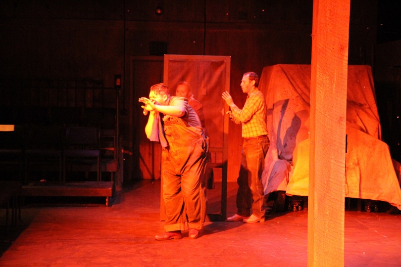
1) I chose the primary color in this photo (R22) in order to accurately capture what a dust storm looks like. The dust bowl is reported to have turned the skies red, and research images of a dust storm in Australia in the past decade inspired the exact shade. It was also chosen to match the opening line of the play, which is "The dawn came, but no day." I wanted to capture the emotion of that line as well.
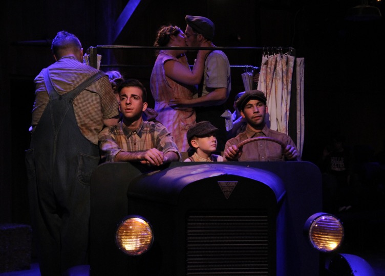
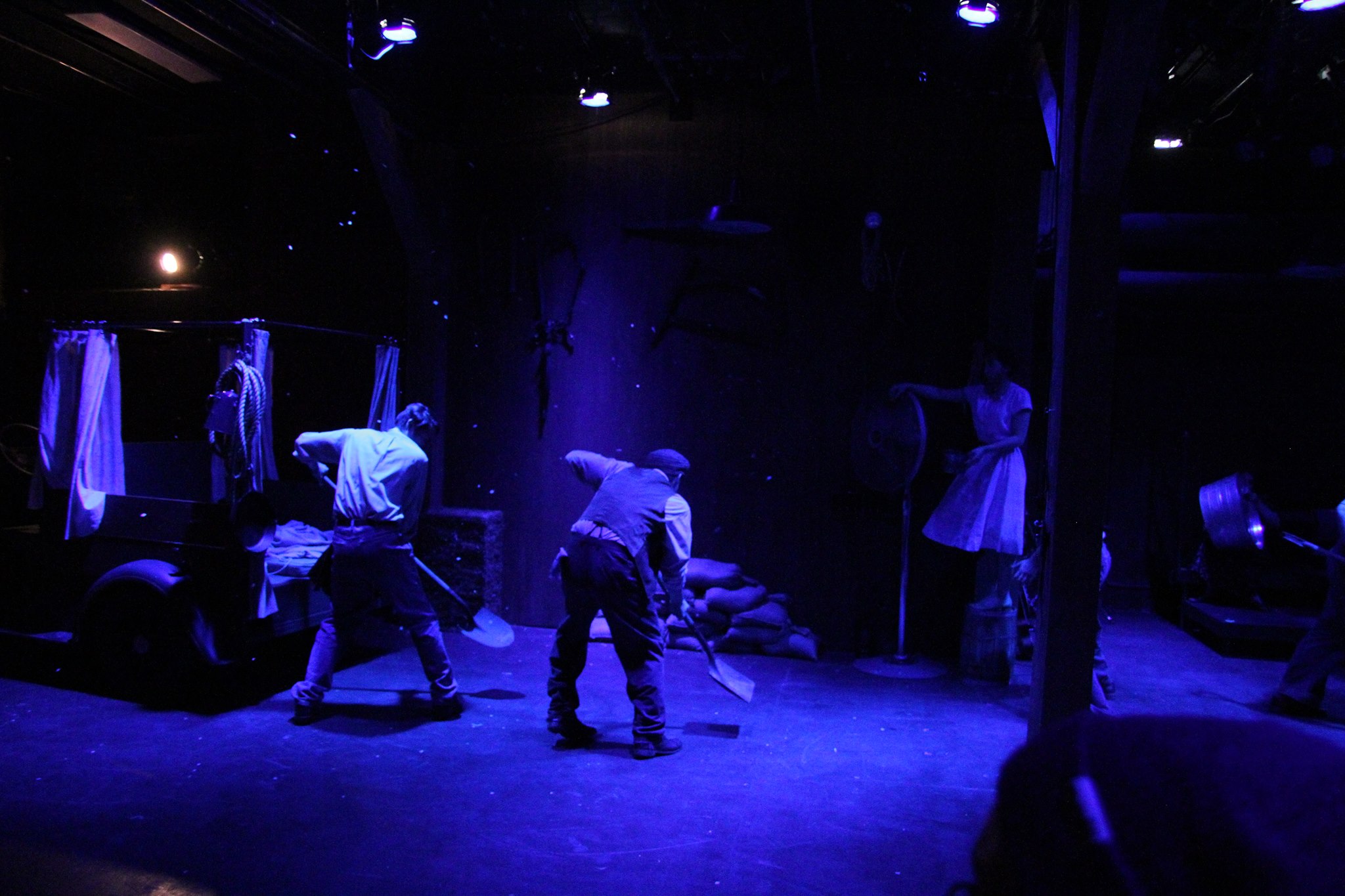
2) I chose the primary color (G890) in order to create a very dramatic night effect. Much of the scene takes place at night, and takes place in extreme darkness. In fact, one of the climactic fights takes place in a total blackout. I wanted to create a deeply saturated blue that would create the environmental effect of deep night, and provide very low visibility. I also chose it so that in scenes where front light (R60) was used, the dramatic effect would melt away and some of the richness of the color would purposefully be lost, which would provide me with the ability to create selective focus.
3) This shows how the G890 described above worked without the front light to create the dramatic effect mentioned earlier. There is also R74, which was used in an earlier river scene, in order to create the effect of water during a storm, and distinguish this look from the just night looks.
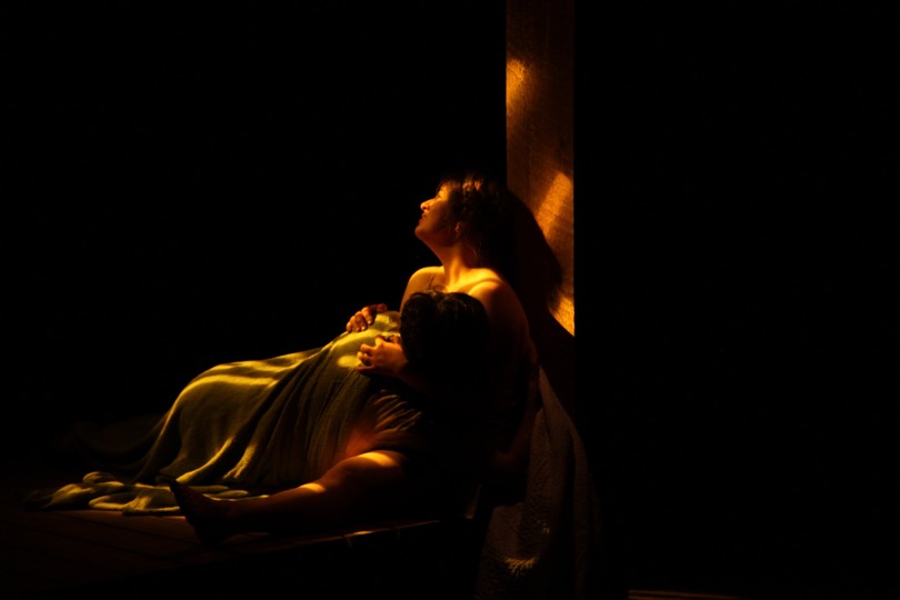
4) Me and the director specifically talked about ending the play with a very soft, intimate look, and having it be dawn in a barn complete with the light coming through the slats. This moment is supposed to represent the strength of human kindness and hope, so I picked a soft amber that would embody those emotions as well as be appropriate for the time of day. This is the last cue of the play, and the first time that R17 was used in the whole show.
Colors Used:
- R04
- R22
- R60
- R57
- R74
- R17